A project of brand identity
The greatest challenge is to condense the identity of a product into a few square inches of paper. Unlike wine, oil labels – apart from a very few interesting projects of packaging – are more formal, with similar colour schemes, consisting of various shades of green and yellow, and with a more central and traditional design
Wine and olive oil are two products closely linked to each other. Vineyards and olive groves form an integral part of the Italian landscape and are the two flagship products of many farms.
Every portion of landscape has its unique peculiarities, which all need to be highlighted, promoted and communicated. It is therefore impossible to generalise.
There are differences in land morphology, soil, microclimate, as well as profound and deep-rooted differences in the cultural traditions of their inhabitants and consequently, also in the cuisine. These are all features that to a greater or smaller extent define not only a region, but also a small, isolated corner of paradise lost in the midst of nowhere.
Communication regarding the produce of a specific area must necessarily exploit the concept of terroir, highlighting all its features and traits. The produce is also the result of the combined efforts of the farmers and people constantly tending the vines, olive trees and all other plants growing there. All of these factors contribute to creating a unique and specific identity.
When defining a project of brand identity and communication strategies for a rural company I find it very useful to go directly to visit the area. It is necessary to breathe in the air, touch the soil, embrace and appreciate the many scents and colours, find new points of reference and in a way, be carried away by Nature, because it can tell us stories of a faraway past.
When dealing with a such a project, it is also very important to listen carefully to the people who day in, day out, farm the land and know its every facet.
We should listen in silence, letting the countryside reveal all its secrets.
Tasting the treasured fruit of the land, there where they see the light, is another stage in the project, equally important.
Being in touch with one’s feelings is almost a luxury nowadays, but we should learn to enjoy the simple things of life, and live these emotions intensely.
Wine, as regards the concept of “product communication” differs extensively from oil. They are two very different products.
Giving them a similar brand identity can be counterproductive: coherence is a journey that should lead us to the discovery of a variety of surprising, fascinating and unique treasures, like the products of the land.
Nobody would use the same label for two different wines, and all the more reason for not using it for oil.
The small-scale producers who start selling their goods have a greater degree of freedom when they enter the market. Having the opportunity of designing the company logo from scratch, defining a both physical and representative identity, the brand image, naming the products, and creating the labels and packaging, is a challenge that the designer must accept, keeping in mind the producer’s dreams and desires. Dreams of the present, but even more so of the future.
Having all the “instruments in order” before facing the market, without having to make adjustments or changes after only a few years, is of paramount importance.
The vision must be clear. The ability and skill of a good advisor can be measured by the time interval separating the present from the future.
Italian wine, after decades of hegemony of “French-style” labels, is now rapidly moving towards more creative ones. We now tend to follow the example set by Spain and Greece, using a fresher and more original approach to label images and claims.
A label should not be an end in itself, an inward-looking element of design, but should reflect the wine contained inside the bottle. There are many ways in which one can communicate its contents, funny, friendly, serious, traditional or even evocative, but the important thing is that the focus is on the product inside.
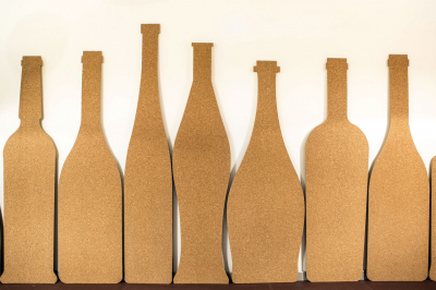
Wine bottles, full of ancient cultural and geographical references, haven’t changed much throughout the centuries: from the consumers’ point of view, it would be difficult to do so.
Things are different for oil: the bottle in this case can be extensively personalised as regards its colour, proportions, shape, so there is great space for creativeness.
Unlike wine, oil labels – apart from a very few interesting projects of packaging – are more formal, with similar colour schemes, consisting of various shades of green and yellow, and with a more central and traditional design.
Also in this case, labels, however beautifully designed, are no good if they fail to communicate the personality, value and identity of the terroir.
The identity of a product, its charm, personality, history and the sensations it can offer must be condensed into only a few square inches of paper. It is a constant challenge, but also a journey of knowledge and creativeness, exploring the personality and most intimate facets of every human being.

To comment you have to register
If you're already registered you can click here to access your account
or click here to create a new account
Comment this news