Southern Italy at your table
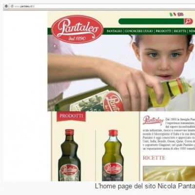
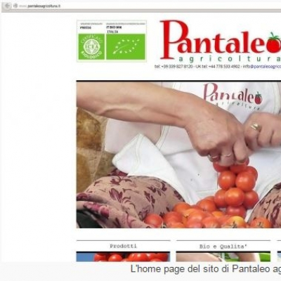
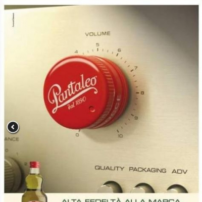
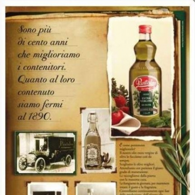
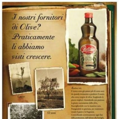
How does oil communicate? What were advertising campaigns like in the past? And nowadays? Our journey to discover the various approaches used to promote the sale and consumption of oil will start from Fasano, home of the Nicola Pantaleo company. And from a photo gallery.
The past was a glorious time for the entire oil industry, but now promotion has definitively ramped down. We would like to know more about the marketing strategies of companies operating in this sector. We shall start our journey from a firm quartered in Puglia, i.e. Nicola Pantaleo.
The company mostly markets its products abroad, but does not neglect promotion in Italy. Their strategy mainly consist of traditional advertising, but Pantaleo also organizes and sponsors a variety of events, mostly cultural, and is also active in the production of films and TV programmes.
We shall focus on the more traditional forms of advertising, presenting a selection of their promotional campaigns.
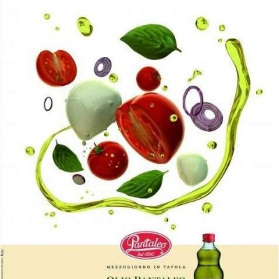
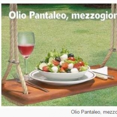
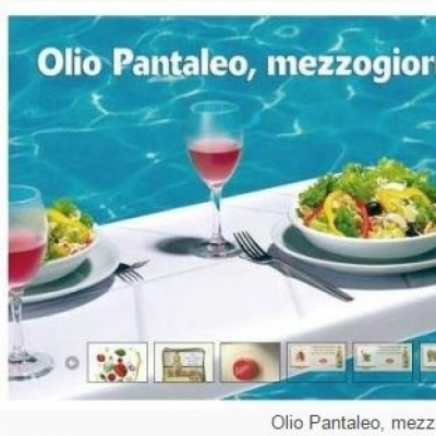
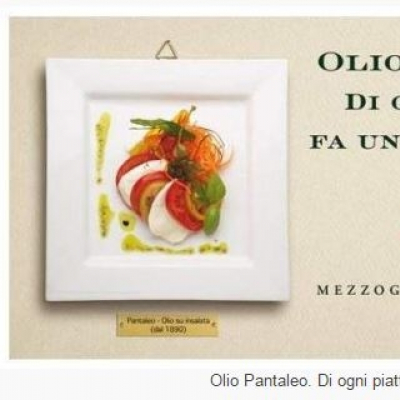
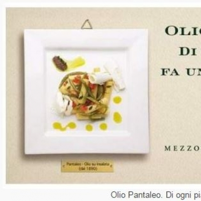
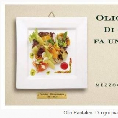
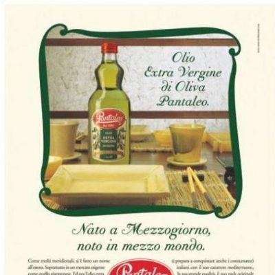
Pantaleo has capitalized on a slogan that focuses on the company’s geographical position: Mezzogiorno in tavola (i.e. Southern Italy at your table). This catchphrase highlights the desire and indeed the joy of serving a healthy meal that has all the flavours of simple yet genuine food. Another slogan employed is “Olio Pantaleo. Di ogni piatto fa un capolavoro” (i.e. Olio Pantaleo. Every dish is a masterpiece). And finally that targeted at the distribution channels is “Alta fedeltà alla marca. Alti volumi di vendita” (i.e. High Fidelity to the brand. Great sales volumes).
The company’s website declares that the first slogan was chosen because it evokes both the traditional cuisine of Southern Italy, and the typical idea of Italian family values. The mind goes back to the good old days when everybody used to gather around the table to have lunch, the main meal of the day.
“It is around these key concepts – explains Donato Pantaleo – that we built all our more recent consumer-oriented promotional campaigns; these consisted mostly of billboards, both large and medium-sized, as well as advertisements and press releases published on weeklies and specialized magazines”.
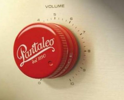
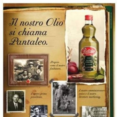
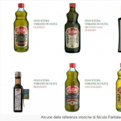
The shape of the bottle is the traditional, exclusive one designed in 1967. The design was never changed, because “it was always extremely popular with the consumers. At the turn of the century we invested large sums of money in restyling both the labels and logo”. Other changes were made too, and new products were marketed. For now we will limit ourselves to displaying the main creations in the photo gallery.
To comment you have to register
If you're already registered you can click here to access your account
or click here to create a new account




Comment this news